HAVE YOUR SAY: Speech Bubbles Opaque or Transparent.
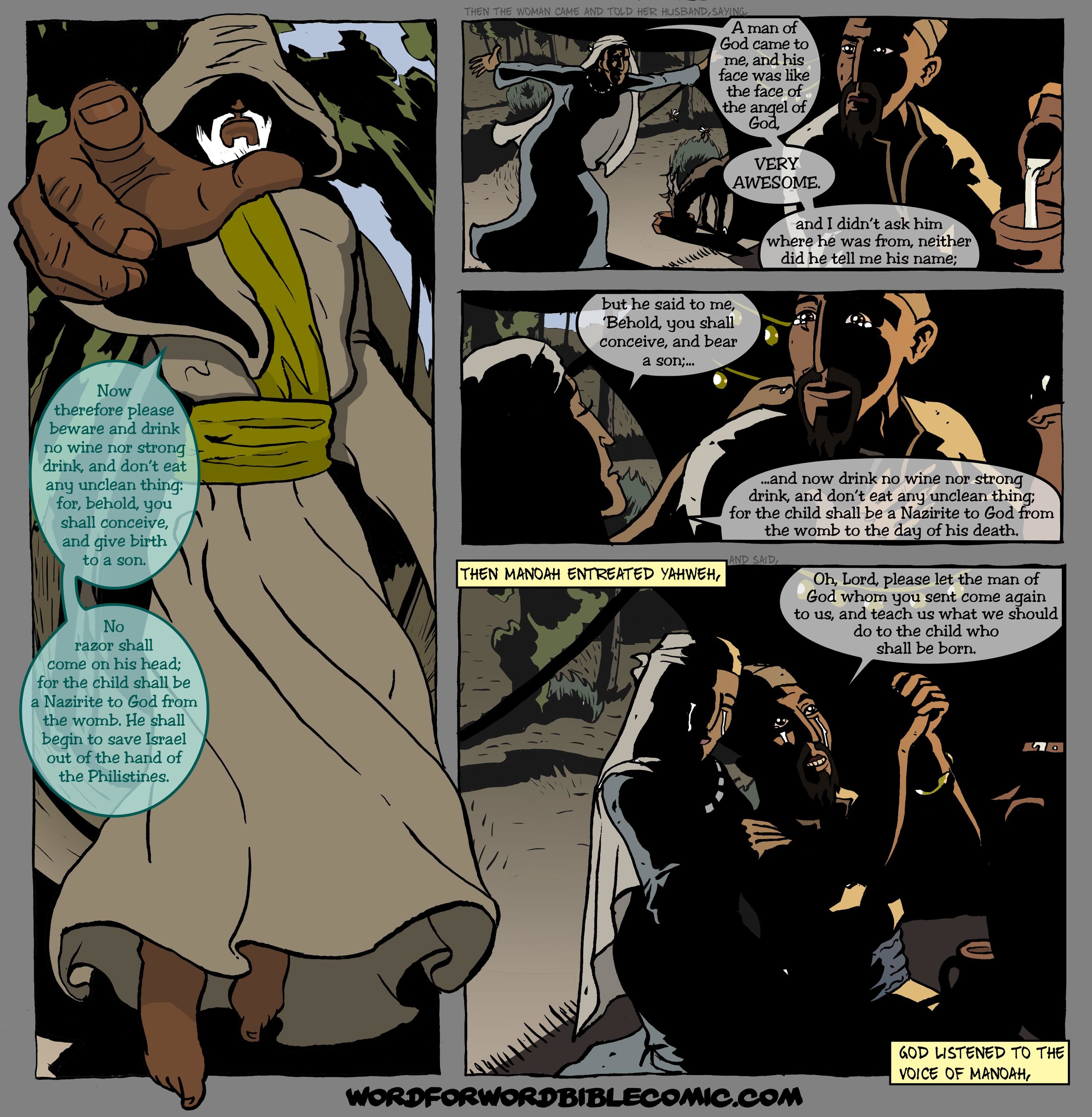
Responding to feedback about the comic I'd like to get your opinion on how the speech bubbles look in the comic. Currently I have them a little bit transparent to allow you to see what lies beneath but the standard way is to have opaque white bubbles. Which would be better in your opinion?
Here are some of the benefits of each as I see them, with an example from Judges 13 .
Opaque :
Clearer and a little easier to read the text
It's the standard, so it's what people expect
Transparent :
You can see more of the picture below
Helps understand the picture sometimes where the bubble cuts into the picture.
It's not the standard and therefore could be an interesting distinctive.
Please add your comments about this and your vote as to which way they should be. If there is a good consensus towards Opaque white speech bubbles I will change them.
If you like this post, you can subscribe to the blog using the RSS here


