Have Your Say: Verse order on Maps, Standard or Dynamic?
You can have your say and influence to way the comic is compiled. Please read below and comment with your opinion.
I am currently applying the text to the page of the comic covering Judges Chapter 1, one of the panels is a map of Canaan and the verses about the places in the story are overlayed on the map. Because the text, can jump around (geographically) the places that it talks about rather than conveniently listing places from north to south, I am considering changing the order of the Bible verses to more clearly fit the map. Before going any further, clearly the verses will still have to make sense and run into each other as they are read even in the alternative order.
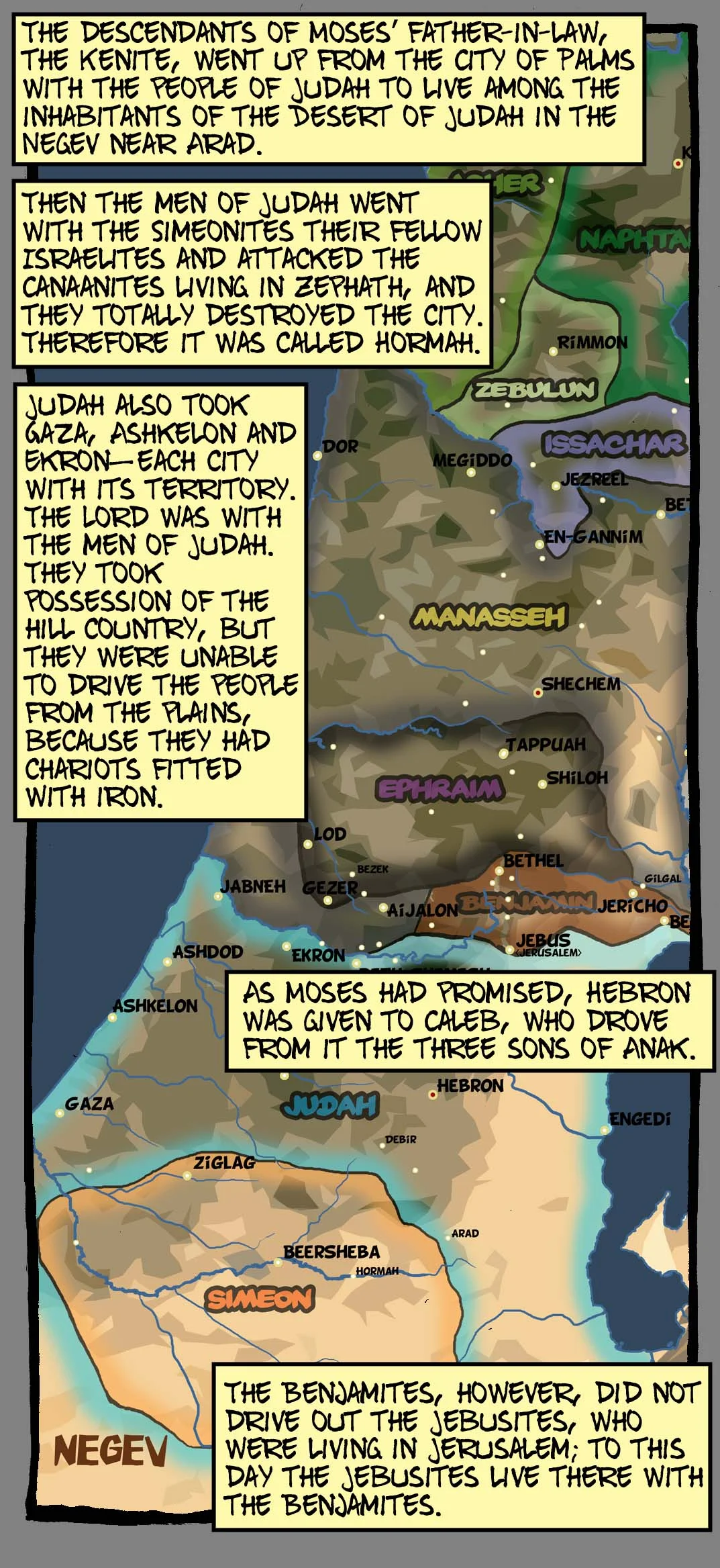
In the example here, verses 16 to 21, there are several stand alone statements made about the events that are occurring. The order doesn't seem important as it does not seem to be listing the events chronologically. So I am thinking of changing the order of the verses to make the content and use of the map more clear. Here are two images with the different methods employed, please take a good look at them and think about which is best in the context of a comic and a comic that claims to be completely unabridged.
Standard: Map with verses out of order.
Dynamic: Map with verses out of order.
(Please note: The different sizes above are due to auto formatting on the blog they are the same size in the comic)
In the example with the correct order the reader need to search for the places mentioned. It cannot have arrows like the other image as they would cross around all over the image and be a mess. But the advantage is the text is un-tampered with.
In the example with the alternate, or Dynamic order you can see that it all still makes sense and the verse order is supplied down the left hand side to inform the reader of the alternate order and allow them to re-read them in the original order if they wish.
If I did charge the ordering I intend to keep any reordering to an absolute minimum and always within the some panel (box) on the page, and I don't think it'll ever be necessary except on maps like this one.
Also please bear in mind that the comic will have a full page map on its own at the front or the back for reference, however that influences you.
In these images both work to a greater or lesser degree. In other places like several chapters in the Book of Joshua, where there is extended talk about the myriad of towns and cities and tribal divisions, I am thinking this flexible ordering will make things a lot clearer for the reader and be able to fully embrace the benefits of this alternative media. If I had to keep the verses in order on sections like Joshua the map image would probably have to be repeated several times in order the get all the info in clearly. However the biblical purist in me wants the verses to be as unadulterated as possible, I don't want the comic to be “my interpretation” of the Bible but as faithful as possible to God's word.
So this is where you can have your say and influence the end produce of the Word for Word Bible Comic. Rigidity stick to the standard order or re-jig slightly with notes to make the text and maps clearer?
Please comment whatever your thoughts on this, I want to see how people feel about this and whether it compromises the unabridged nature of the work.


